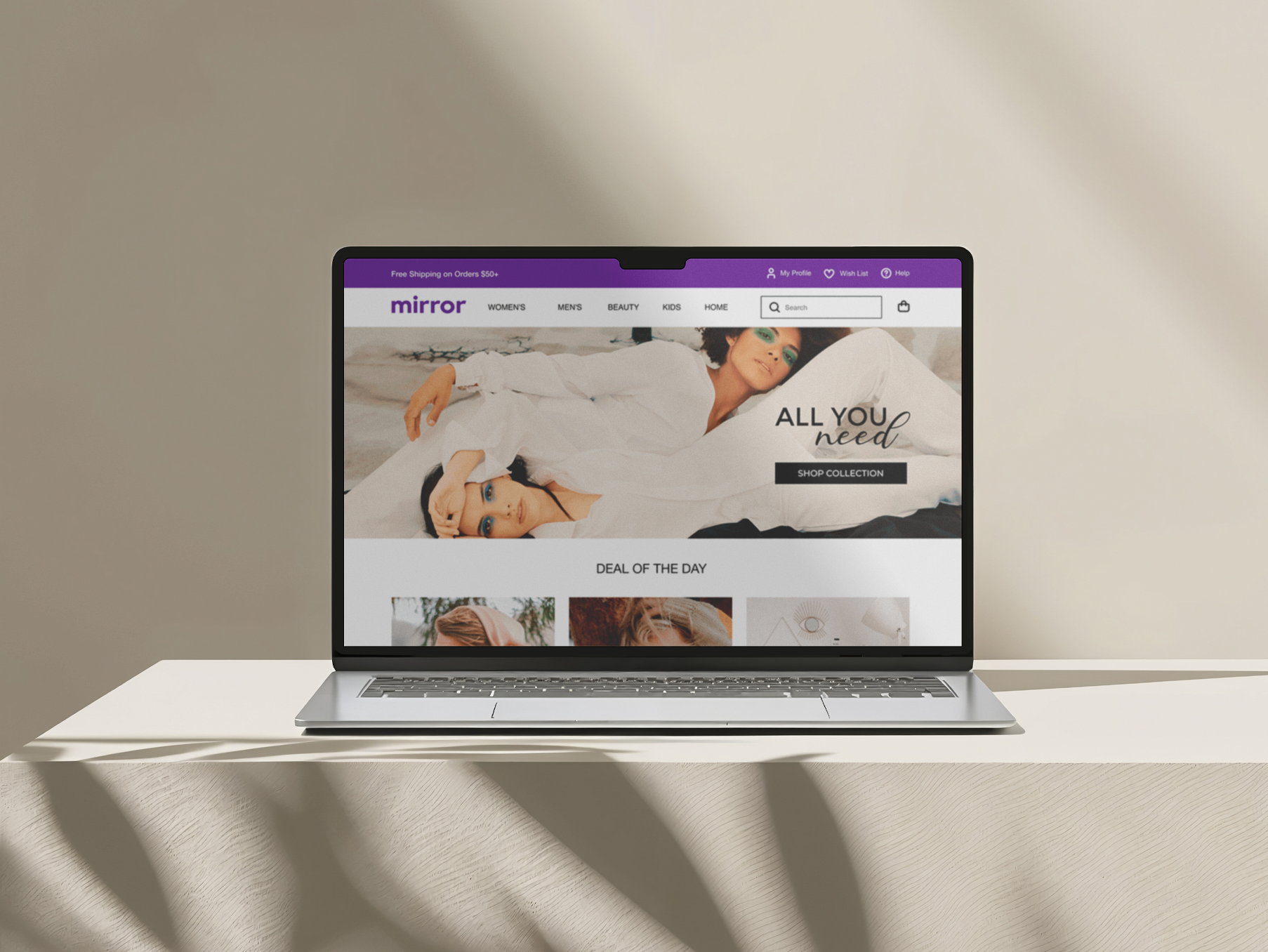
Streamlining the purchase flow for a fashion e-commerce
Impacts
Fewer checkout steps
reduced cart abandonment
Guest checkout accelerated
first-time purchases
Clear progress indicators
sped up completion time
Consistent visuals
reinforced trust at checkout
Introduction
Mirror is a global clothing store that sells multiple styles such as casual, business, sport, party, and formal for a cheap price but with good quality. Mirror has 400 stores around the world in 32 countries.
Creative direction
Problem
Mirror's existing website contains information about locations, promotions and the company, but does not have an online store. Customers have been asking for online sales for their convenience.
Goal
The goal is to expand sales channels, offering convenience to customers through our new e-commerce store with a new brand identity and increasing sales.
Deliverable
Brand Identity · UX Flow · Wireframes · UI Design · Design System
Research
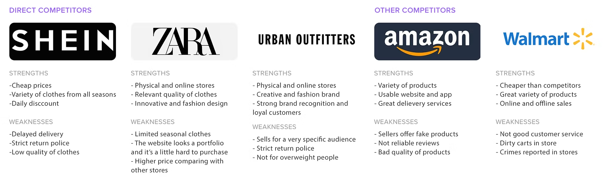
The objective of the research will be to understand people's habits, behavior, frustrations, needs, and how to communicate with them. Additionally, our goal is to attend to online customers properly and offer a great experience on Mirror's website.
Key findings
- Shipping costs appeared unexpectedly late in the flow, causing last-minute drop-off. · Long forms with no progress indicator left users unsure how many steps remained.
- Guest checkout was frequently requested, since forced account creation added friction. · Visual identity felt disconnected between browsing and checkout screens.
Brand identity
To rebuild trust throughout the purchase flow, I extended Mirror's brand system — a confident purple palette paired with clean, modern typography — into every step of checkout, so the experience feels seamless from homepage to order confirmation.
Color palette
RGB: 84, 22, 144
CMYK: 83, 100, 4, 1
RGB: 255, 67, 94
CMYK: 0, 88, 51, 0
RGB: 53, 205, 234
CMYK: 73, 0, 43, 0
RGB: 234, 234, 234
CMYK: 7, 5, 5, 0
RGB: 15, 15, 15
CMYK: 74, 67, 66, 84
Brand Design
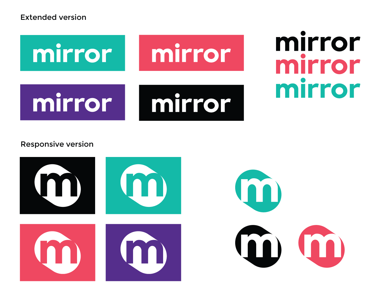
I looked for inspiration from visual concepts and typography that would be ideal for the brand.
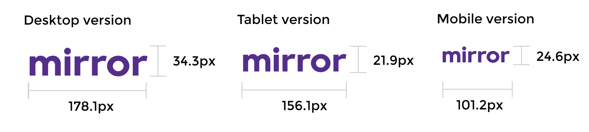
Building a responsive logo was one of the top priorities of the creative process.
Typography
H1 Headline
Montserrat Bold 55pt
H2 Headline
Montserrat Bold 40pt
H3 Headline
Montserrat Bold 30pt
Subheader
Montserrat Regular 40pt
Subheader
Montserrat Regular 30pt
H3 Headline
Montserrat Regular 25pt
Body
Montserrat Medium 27pt
Body
Montserrat Medium 25pt
Body
Montserrat Medium 18pt / 20pt
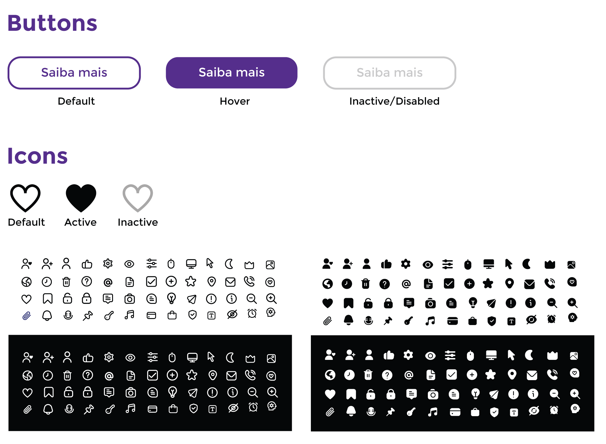
Design System
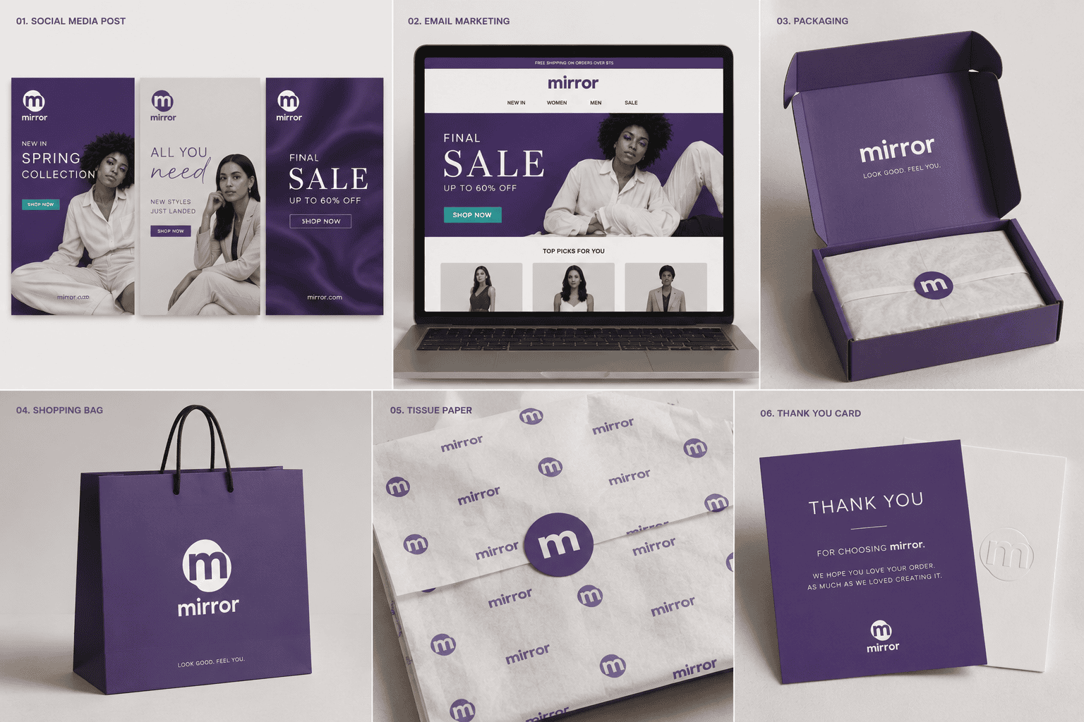
Brand applications
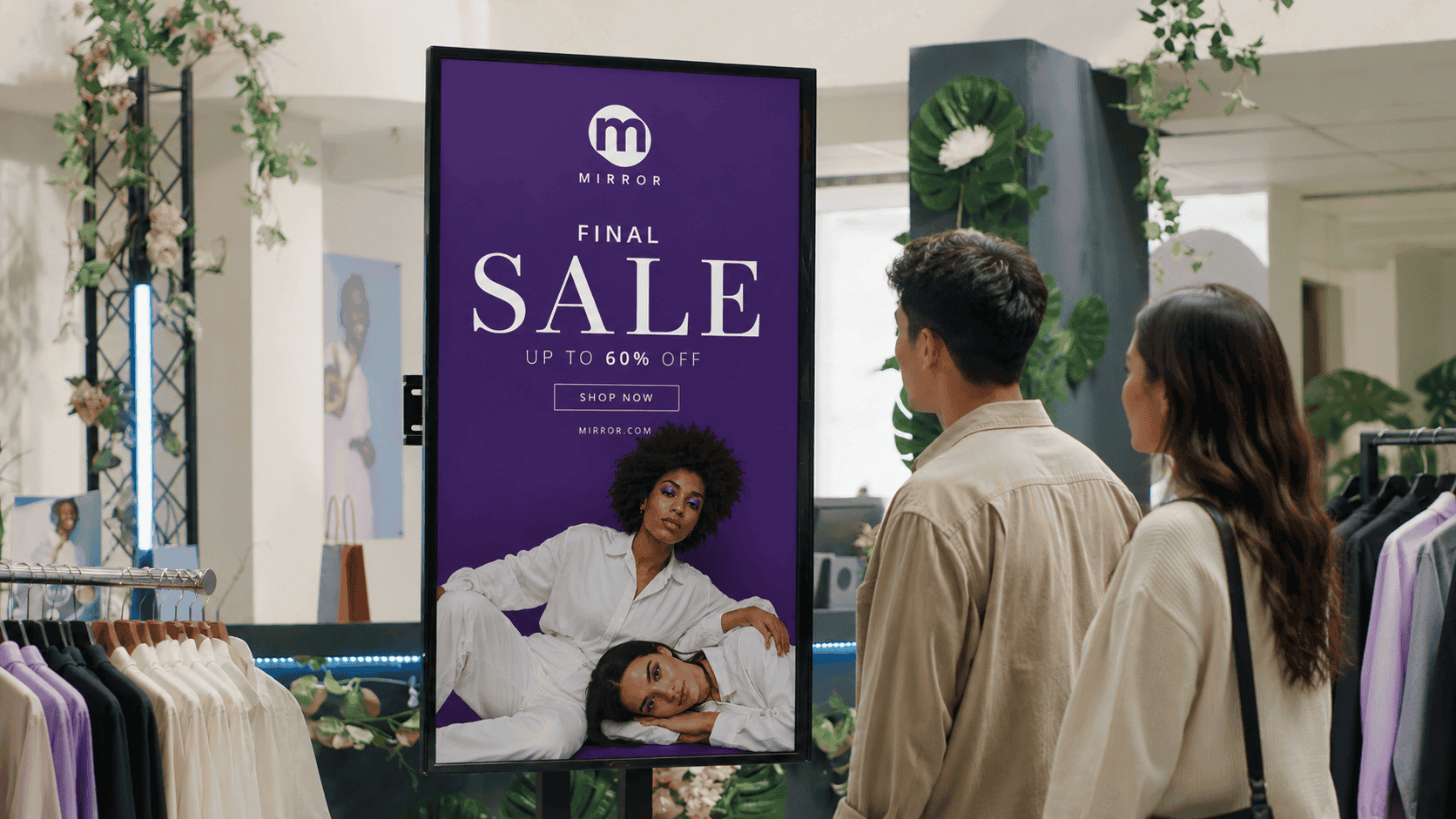
Taking the identity beyond the screen — onto packaging, product tags, and social — so the experience feels consistent at every touchpoint.
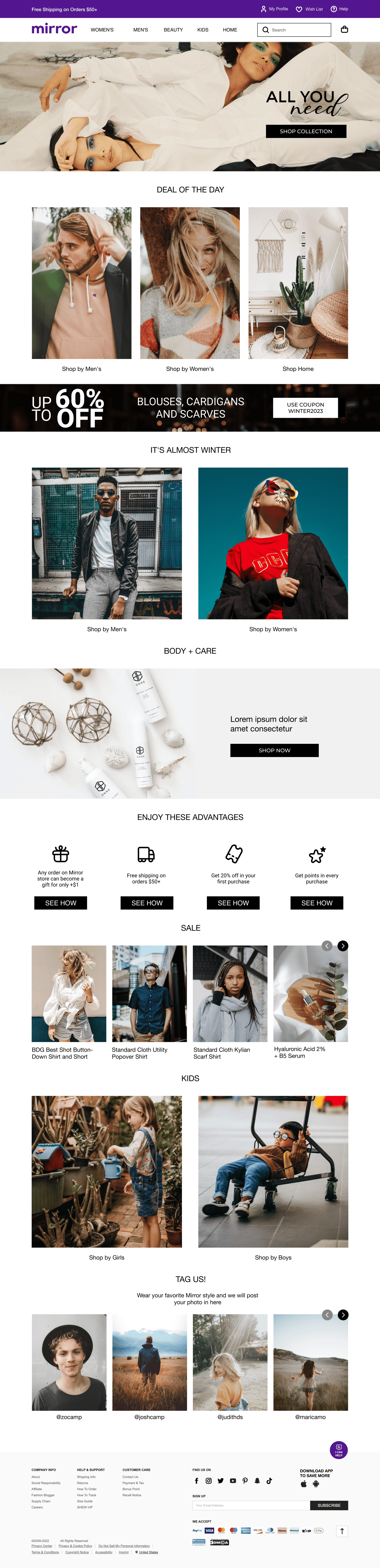
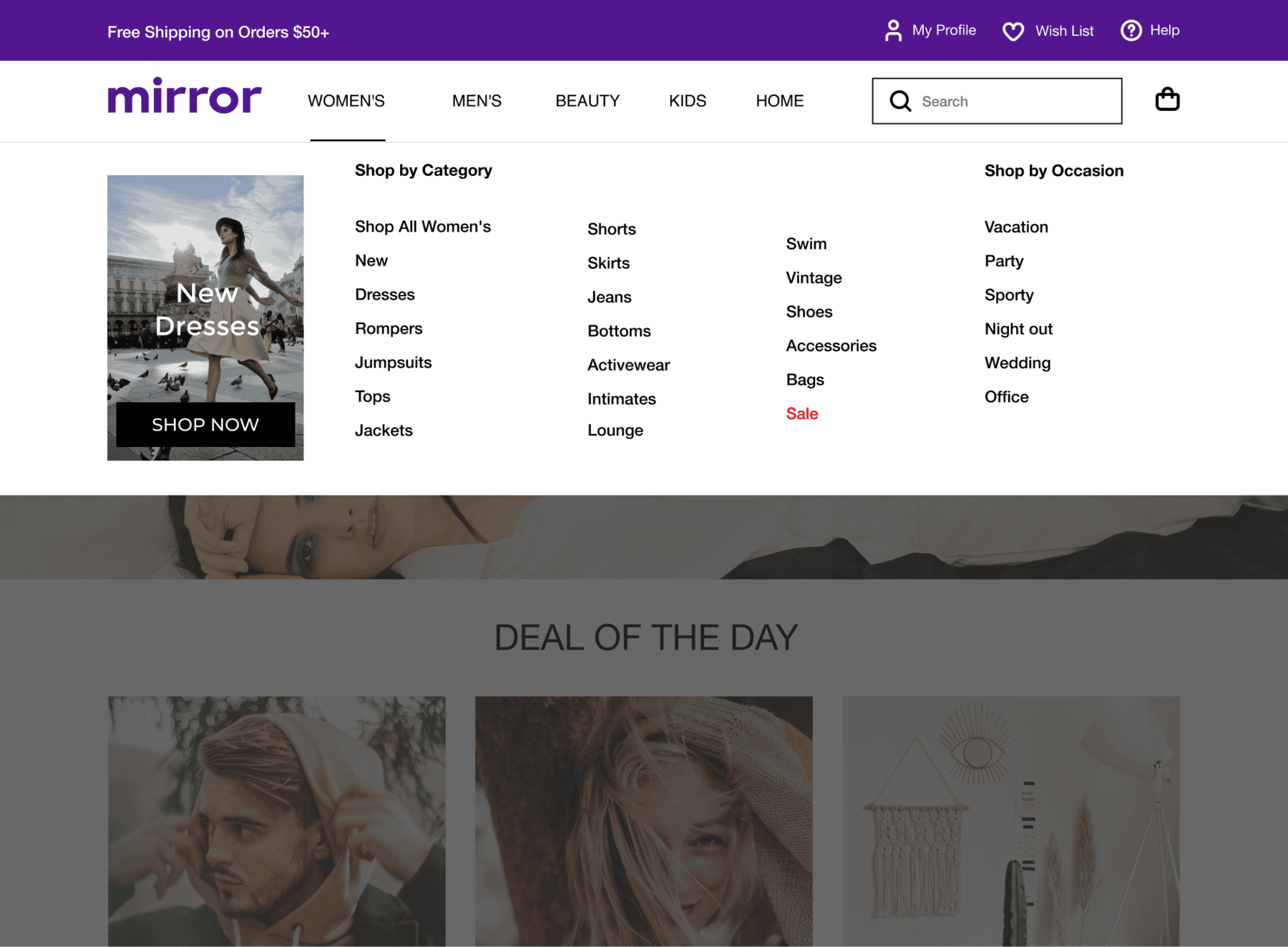
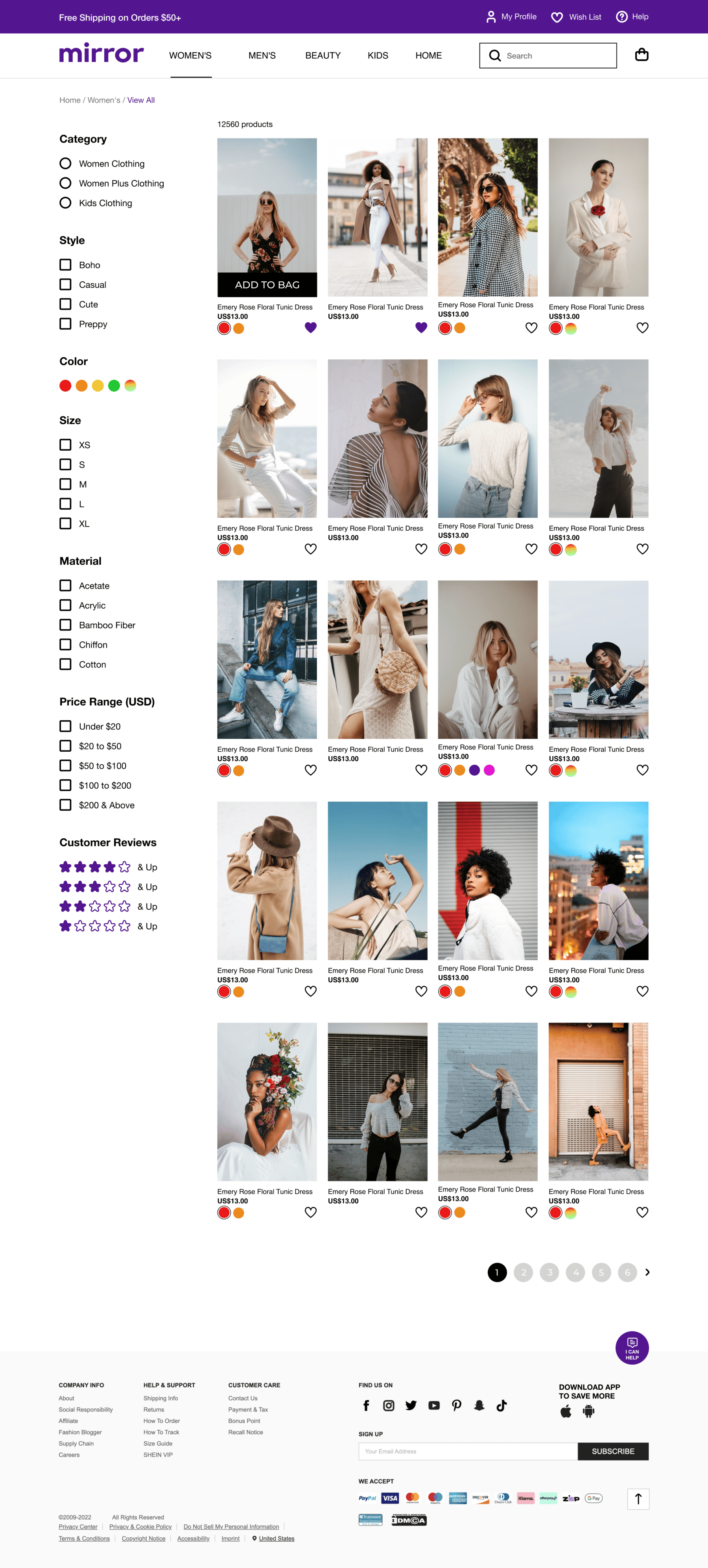
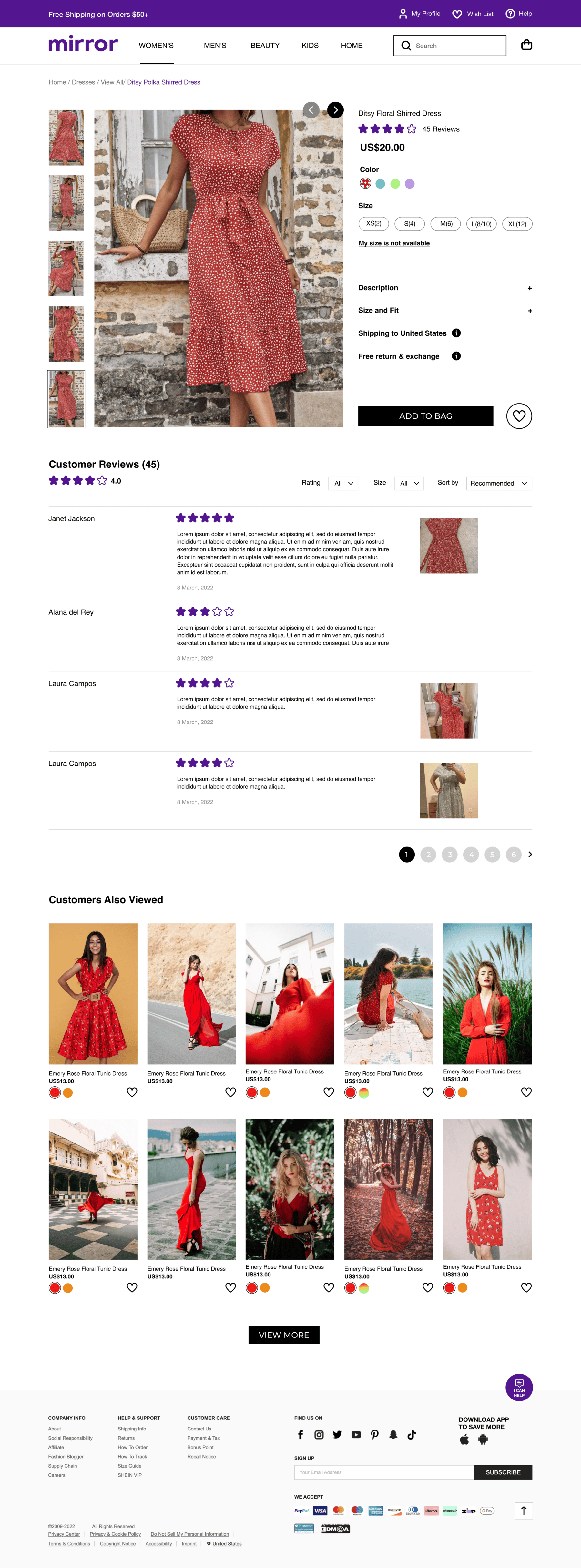
High-Fidelity Wireframes:
Desktop
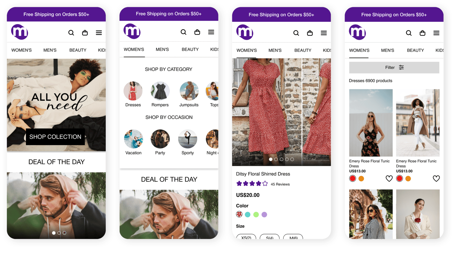
Mobile
The experience adapts seamlessly to smaller screens, keeping navigation and shopping just as effortless on the go.
Conclusion
By carrying Mirror's brand identity all the way through checkout and cutting the flow down to its essential steps, shoppers move from cart to confirmation with more clarity and confidence, turning browsing into completed purchases.