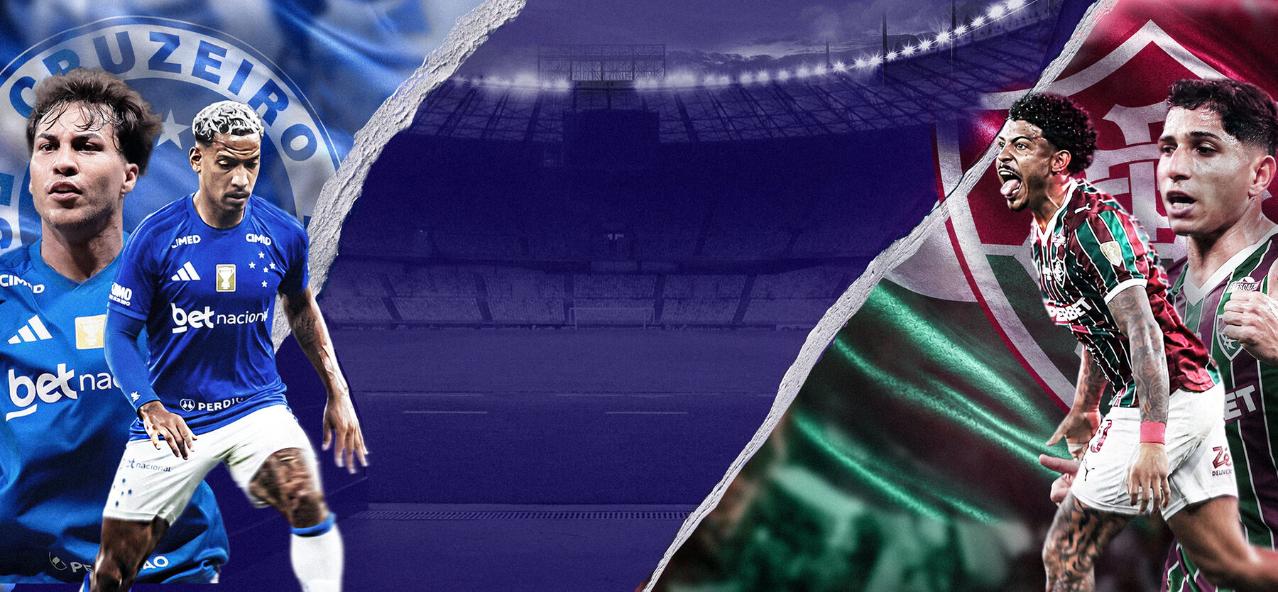
Building a Scalable Match-Day Visual System for RecordPlus
Overview
A season-long visual campaign created for RecordPlus to promote Brasileirão and Paulistão across TV and digital platforms.
The challenge was to build a flexible visual system capable of supporting hundreds of match-day communications while maintaining a consistent, recognizable brand presence across formats.
Creative Concept
Challenge
How do you create hundreds of match-day assets — across different teams, formats, and platforms — while keeping everything visually consistent and instantly recognizable?
The flag became the visual language.
Instead of starting from the competition logo or team badge, the concept came from the stands. The waving motion of stadium flags — a symbol of passion and collective energy — became the visual and conceptual foundation of the entire system. From typography to composition, everything moves with the flag.
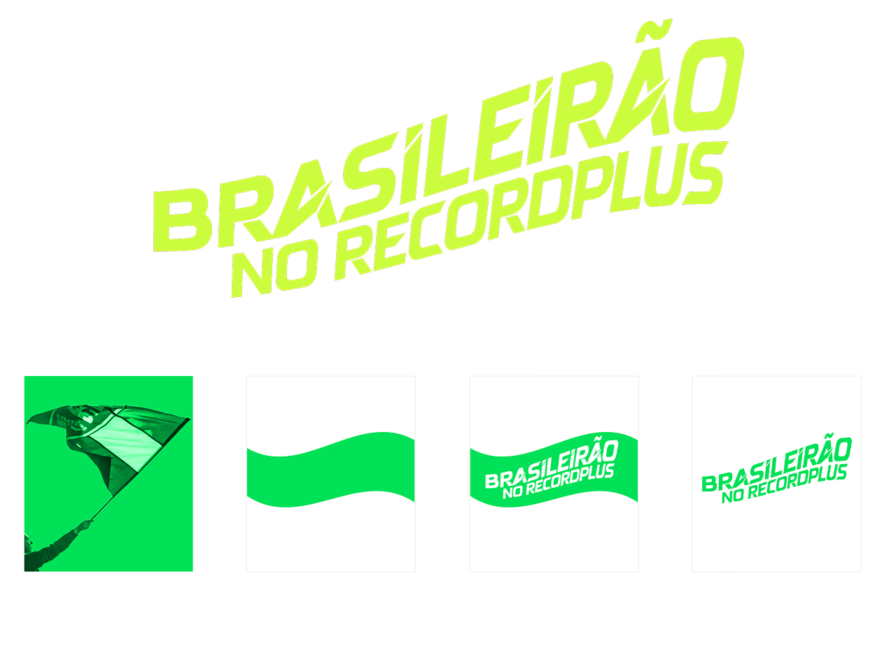
A title that moves with the flag.
The challenge was translating movement into type. The typography was designed to replicate the wave motion of flags in the wind — creating letterforms that feel alive, passionate, and in motion.
- → Fans & flags — reference research from real matches and supporter culture
- → Movement study — motion analysis translated into type rhythm and distortion
- → Typography — custom title treatment using AVEGA with wave-based construction
- → Final shape — a flexible title system that works across all formats
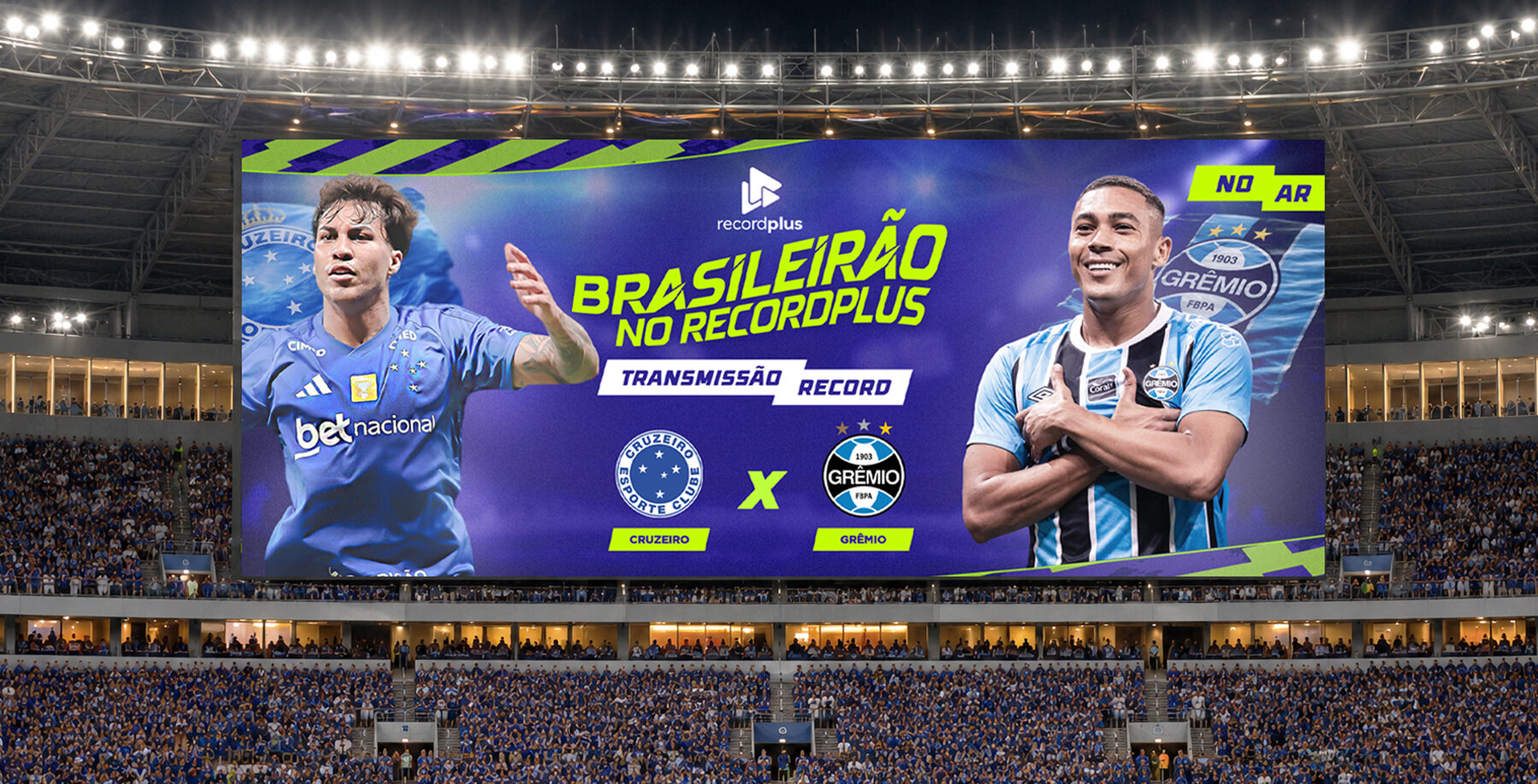
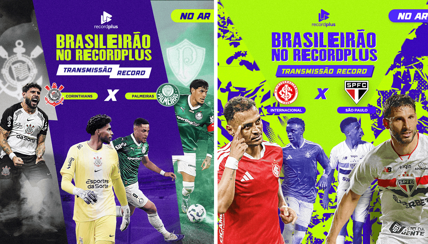
Design System
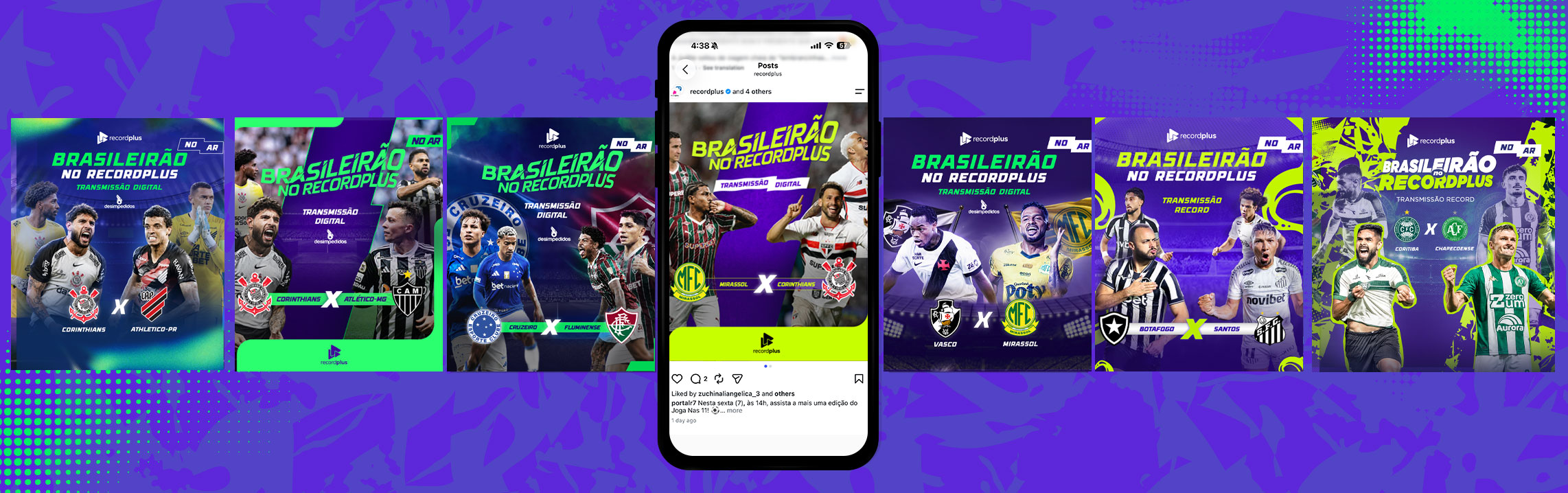
Every asset in the system shares the same foundation — defined color palette, a single typeface family, a consistent image treatment, and a grid-based composition system. Together, these rules make it possible to produce new assets quickly without ever compromising visual quality.
Color palette
Typography
Display / Headlines
Body / Supporting text
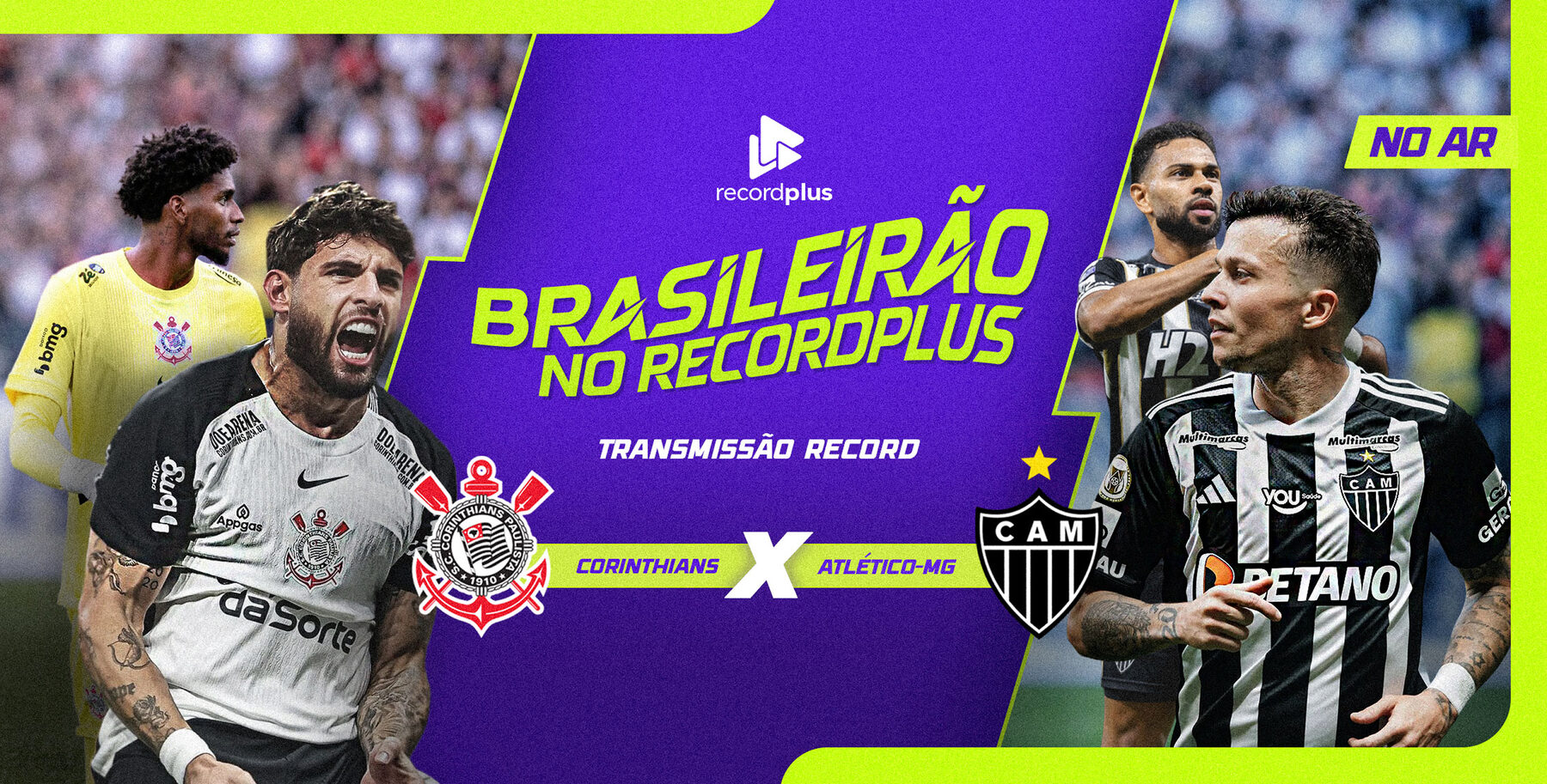
Applications
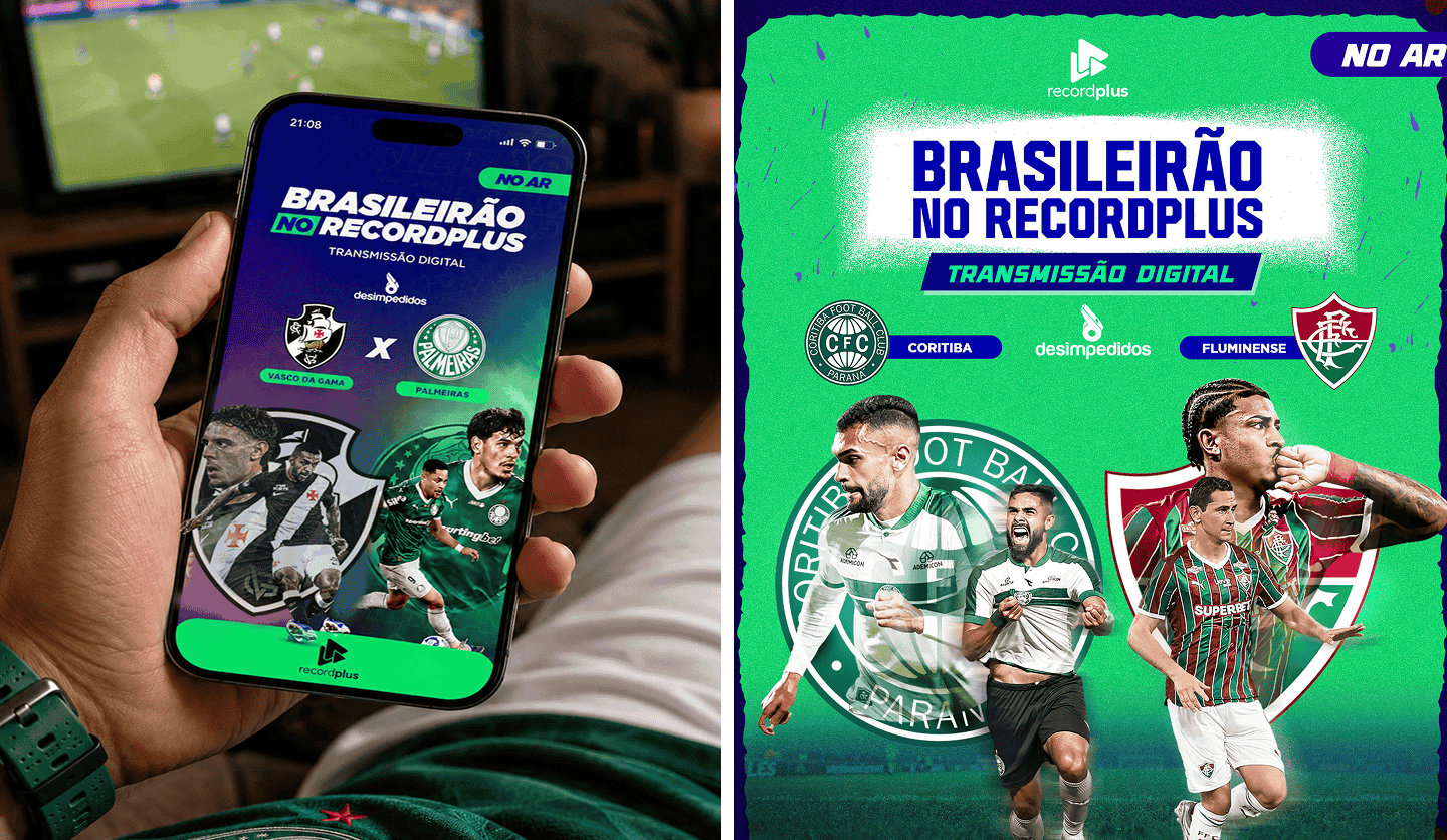
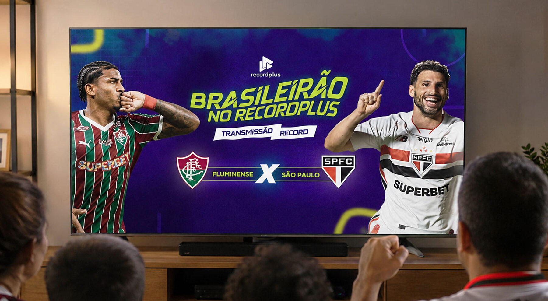
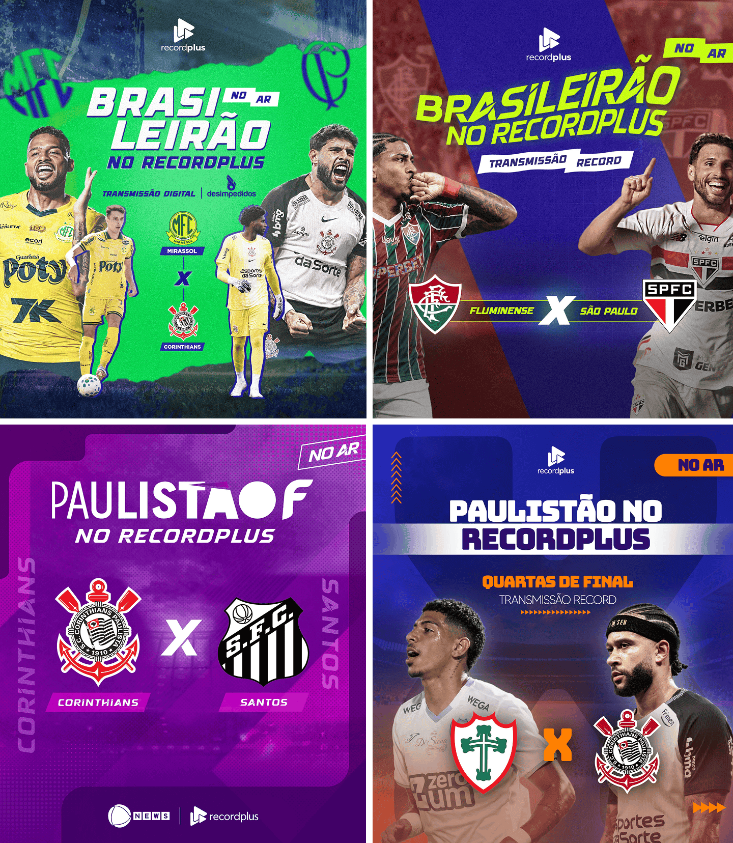
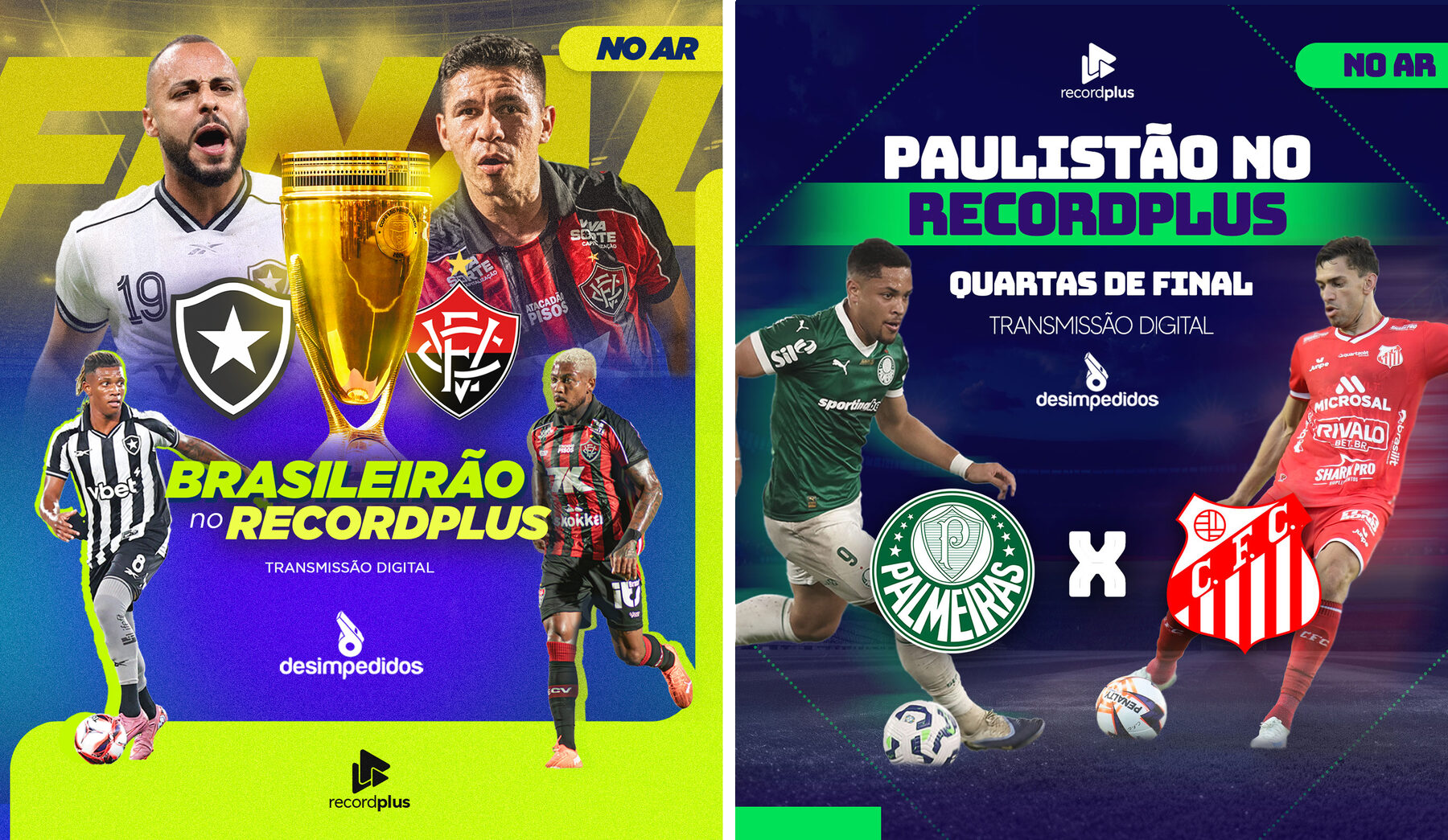
The system was rolled out across every touchpoint of the championships: TV broadcast graphics, social media posts, mobile stories, and broadcast bumpers. Each format was adapted without losing the visual identity.
- TV broadcast · Social media · Mobile stories · Broadcast bumpers
Scale & Impact
Expanded audience reach
through consistent
multi-platform campaigns.
Increased brand visibility
across TV and
digital platforms.
Supported the
promotion of
300+ live matches.
Reduced production
time with reusable
design assets.