Client: Houston Rockets
My role: UX Research · UX/UI Design · Design System · Prototyping
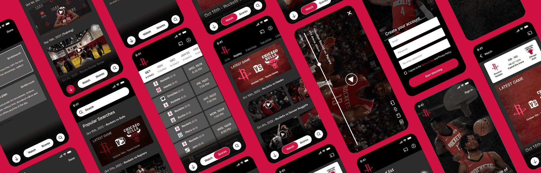
I redesigned the Houston Rockets mobile experience to bring game-day information, content, tickets, and fan engagement into one cohesive digital ecosystem.
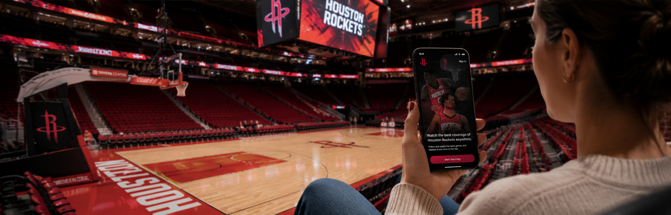
Houston Rockets fans faced a fragmented digital experience, making it difficult to access game information, tickets, news, and merchandise in one place.
Create an intuitive mobile app that centralizes key fan experiences, improves engagement, and strengthens the Houston Rockets brand through a seamless user experience.
Research · Prototype · UX/UI Design · Wireframes · Animation
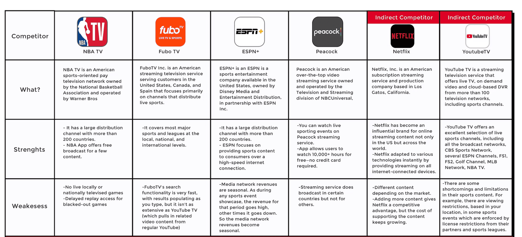
Research was conducted on competitor apps to identify strengths, weaknesses, and usability patterns. The findings helped inform key design decisions and highlight opportunities for improvement.
Competitor apps prioritized content consumption but lacked a unified fan experience.
Fans had to switch between multiple platforms to follow games, buy tickets, and access exclusive content.
Create one destination where fans can follow games, access content, manage tickets and engage with the team.
The Houston Rockets' identity — red, black, and white — is bold and athletic. Rather than reinventing it, I translated these values into a digital design language built for fast, immersive fan experiences.
A strong, legible type system designed for quick scanning during live games — clear hierarchy from headlines to body copy, with weight and size doing the heavy lifting.
Dark surfaces create immersion and focus. Rockets red is reserved for primary actions and key moments — used sparingly so it always commands attention.
Hierarchy first. Every screen is designed so fans can find what they need in seconds. Contrast drives engagement. Motion is purposeful and never decorative.
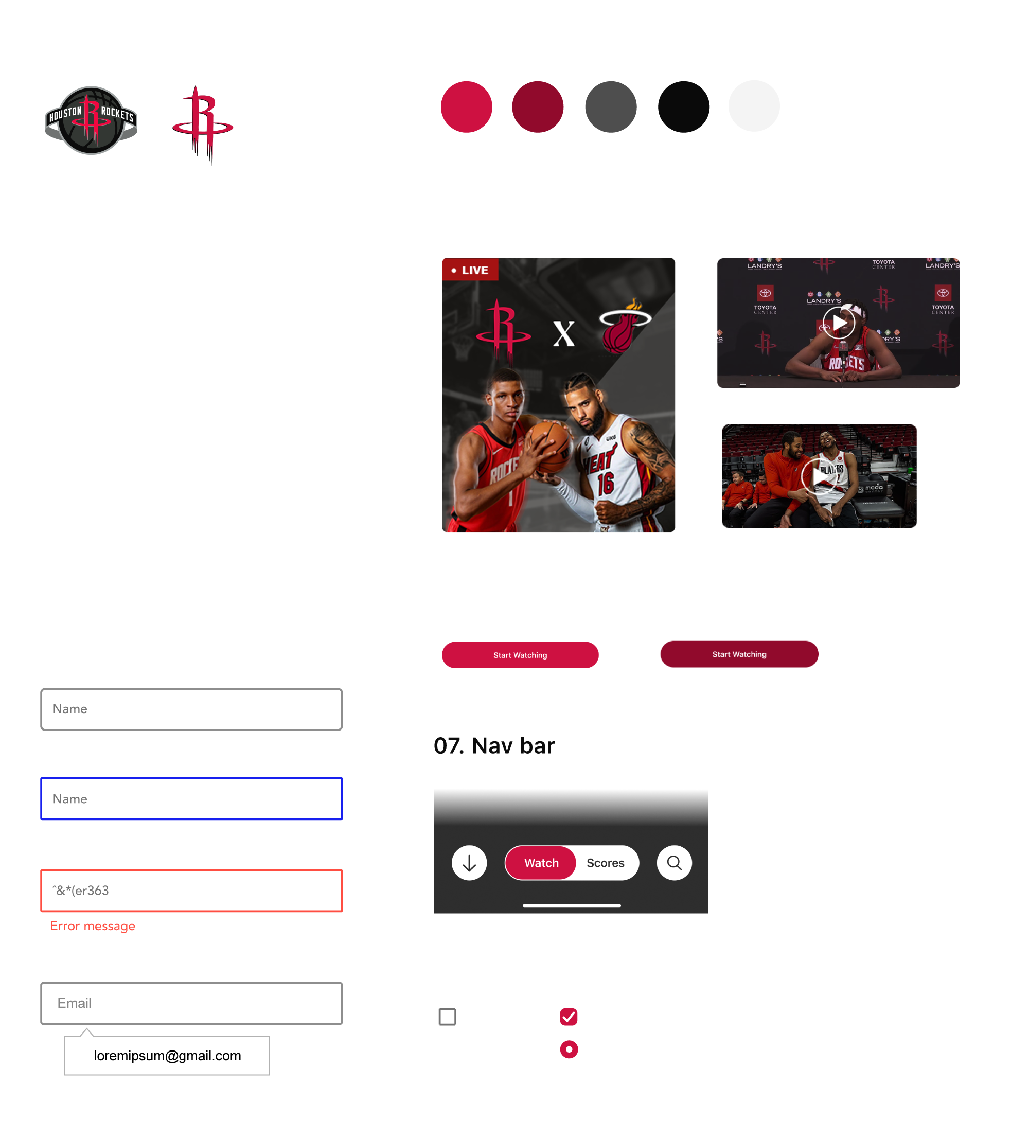
I translated the Houston Rockets brand into a flexible UI system designed to create consistency across the app while preserving the energy of the team identity.
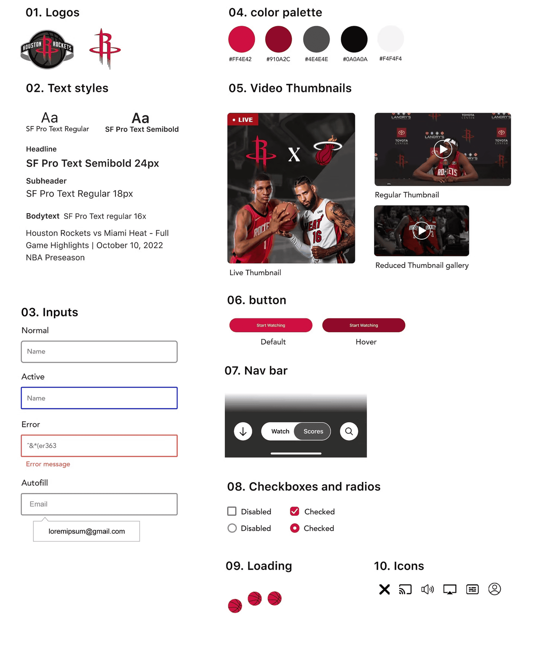
The system balances the Rockets' bold brand identity with a clean, functional interface, using red as an accent rather than overwhelming the experience.
This project introduced me to the sports industry and required extensive research, while helping me explore how to strengthen the connection between fans and the Houston Rockets. The app made games more accessible by centralizing everything fans need — and taught me how to balance brand energy with product clarity.