Modern Visual Identity for a Content Agency
Impacts
Brand recognition
through a consistent
visual system
Improved professionalism
and market positioning
Marketing materials
& digital assets
Stronger market
positioning for
the agency
Introduction
Studio AD is a content agency that needed a complete visual overhaul to better reflect its positioning in a competitive market. The existing identity felt outdated and disconnected from the quality of work the team was delivering. The goal was to craft a modern, cohesive brand system that communicated creativity, professionalism, and versatility.
Creative direction
Problem
Studio AD's previous identity lacked consistency and visual impact. The logo felt generic, the color palette was inconsistent across touchpoints, and the overall brand presence didn't communicate the agency's creative expertise or ambition.
Goal
Develop a refined visual identity — including logo, typography, color system, and brand applications — that positions Studio AD as a premium content agency while remaining flexible enough for a wide range of communication formats.
Deliverable
Brand Strategy · Logo Design · Color System · Typography · Brand Guidelines · Marketing Materials
Process
Old logo

Sketches & exploration
The design process began with extensive sketching and concept exploration. I explored multiple directions for the logo mark, focusing on letterforms and symbols that could convey the agency's forward-thinking approach and content expertise.

Color palette
Primary colors
RBG: 28, 38, 118
CMYK: 100, 97, 23, 11
RBG: 53, 205, 234
CMYK: 61, 0, 8, 0
RBG: 89, 247, 134
CMYK: 53, 0, 71, 0
RBG: 255, 64, 75
CMYK: 0, 89, 67, 0
Secondary colors
RBG: 234, 234, 234
CMYK: 7, 5, 5, 0
RBG: 160, 160, 160
CMYK: 40, 32, 33, 0
RBG: 38, 43, 73
CMYK: 90, 83, 43, 43
Typography
1234567890!@#$%^&*()?";,
1234567890!@#$%^&*()?";,
1234567890!@#$%^&*()?";,
Brand identity
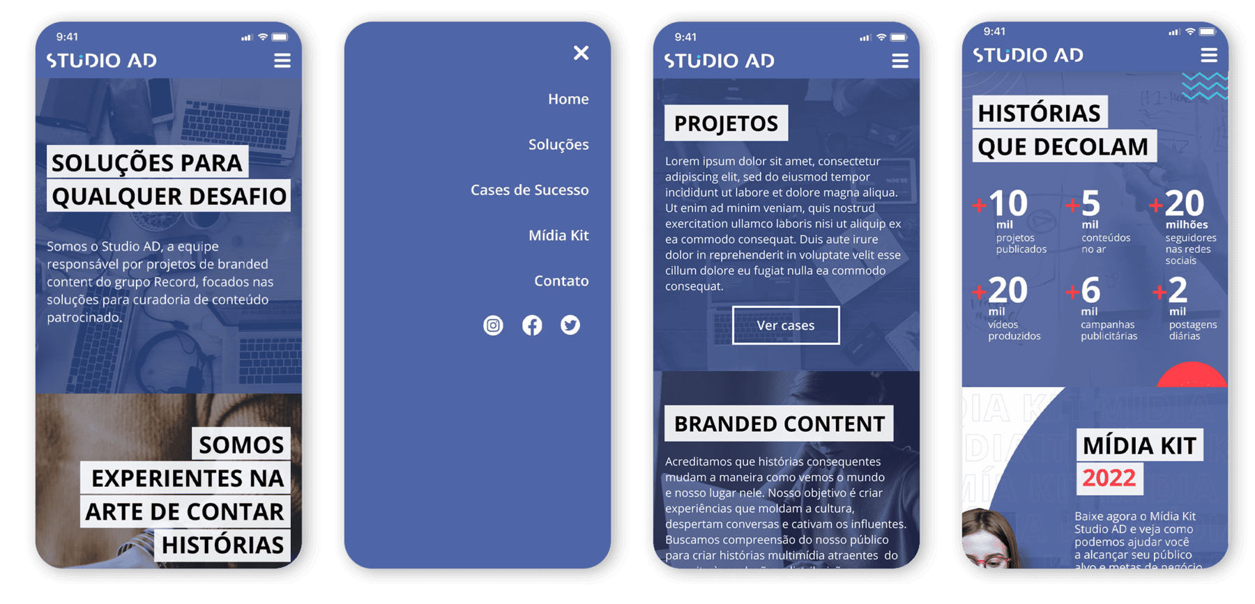
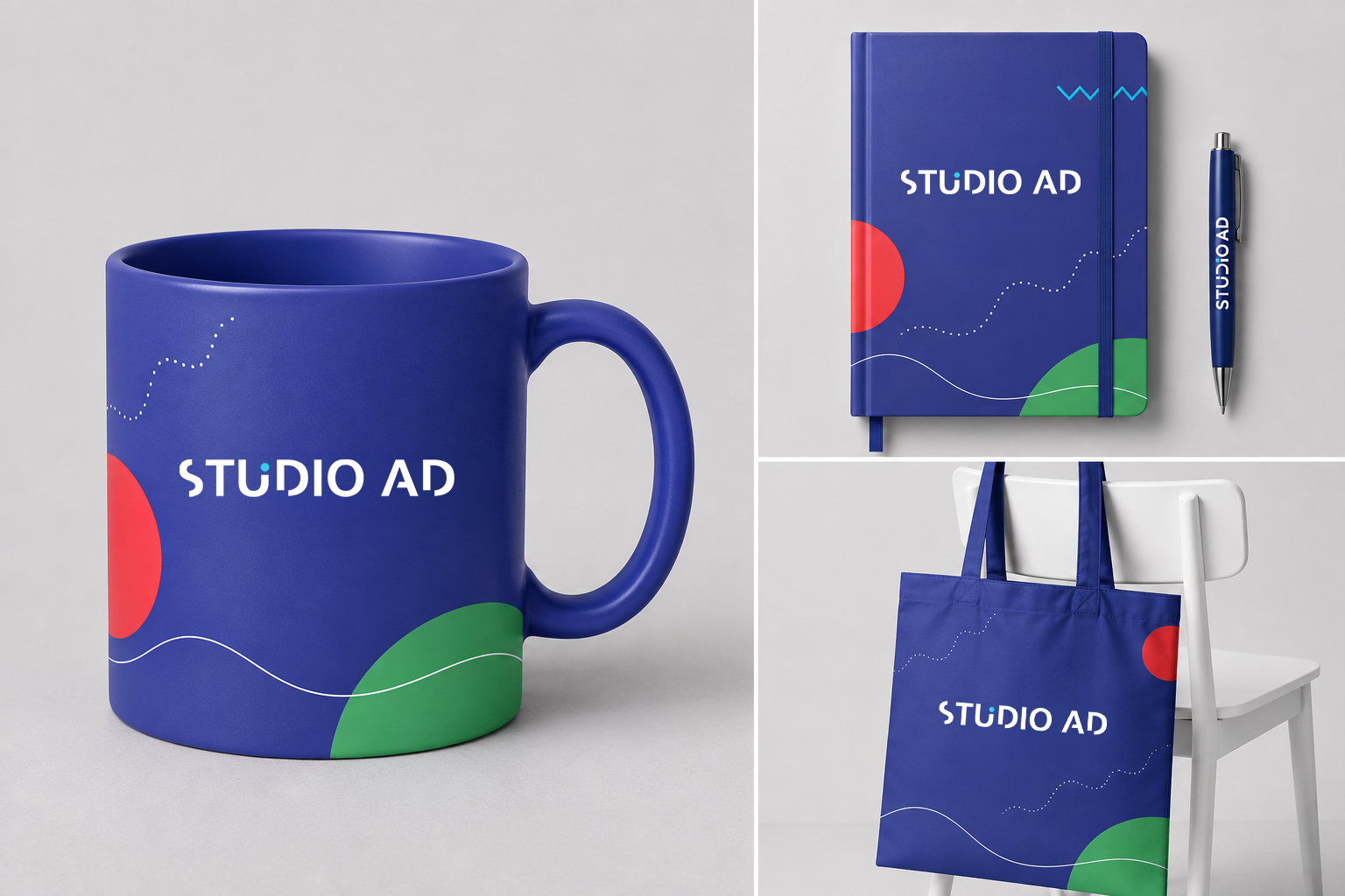
The new identity system was built around a clean, confident visual language. The updated logo, color palette, and typography work together to create a consistent and memorable brand presence across all touchpoints.


Marketing materials
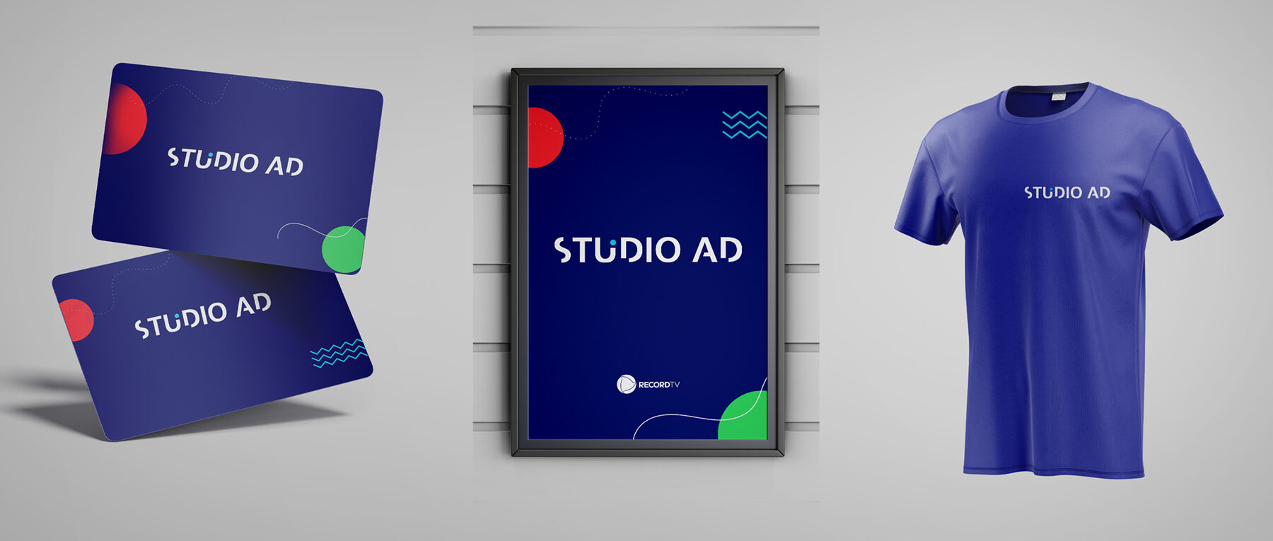
With the identity defined, I extended the system across key marketing materials — including social media assets, banners, and campaign collateral — ensuring the brand felt consistent and compelling at every customer touchpoint.
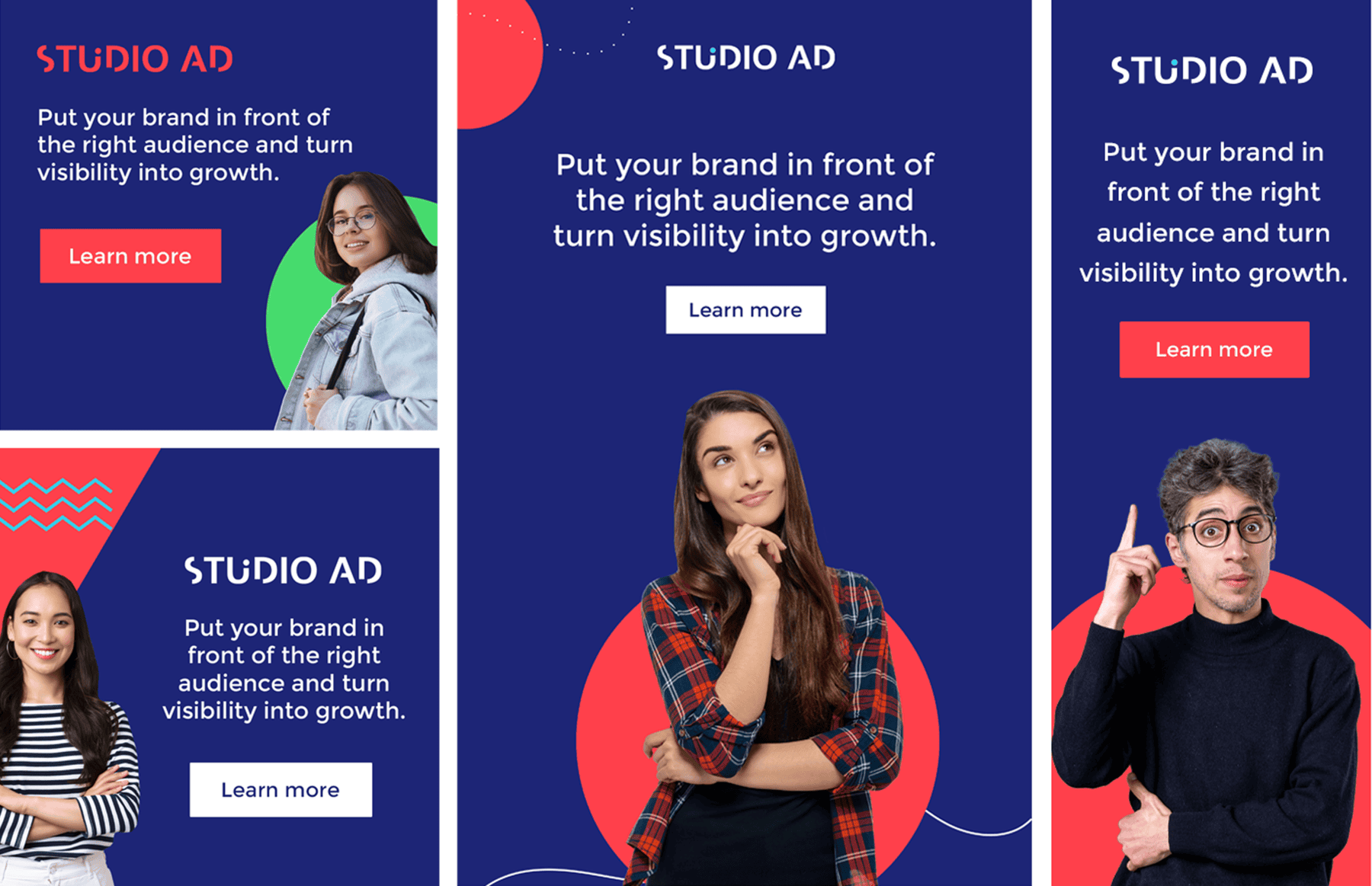
Banners & digital assets
A comprehensive set of digital banners was produced for various platforms and formats. Each piece adhered to the new brand guidelines while adapting to the specific requirements of each format.
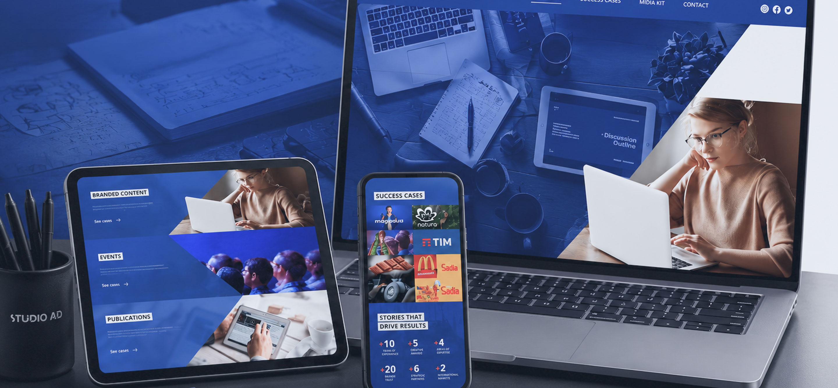
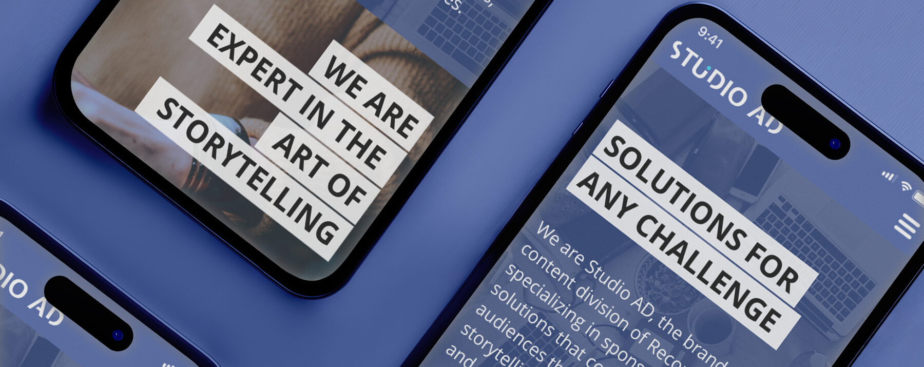
Website
Responsive